HBO
The Leftovers: Main Titles
My Role: Creative Lead, Designer, Typographer
Awards: 2016 SXSX Excellence in Title Design Nominee
Created at Elastic
The Leftovers is a television drama series on HBO about life after 2% of the world's population suddenly and inexplicably disappears.
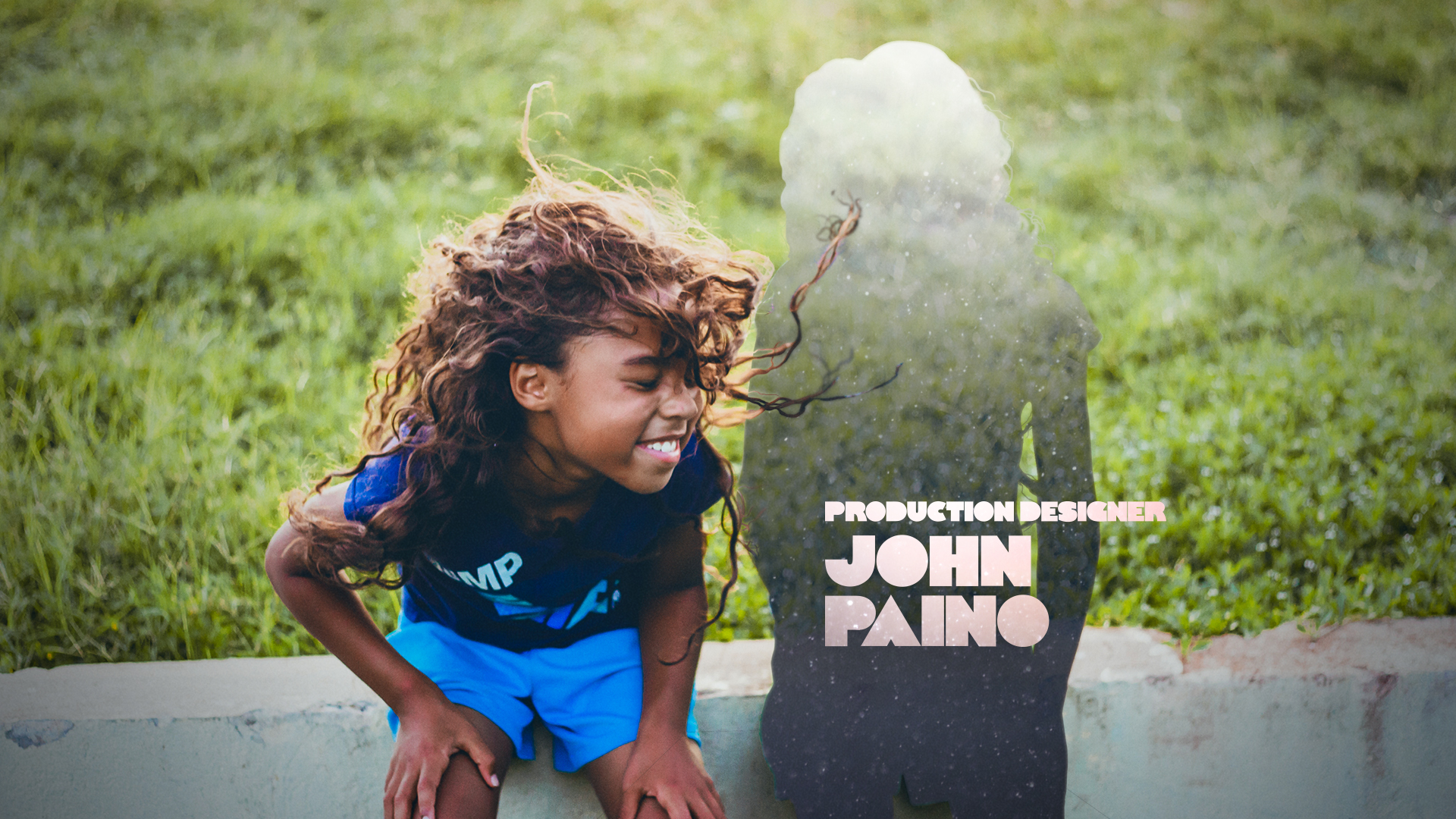
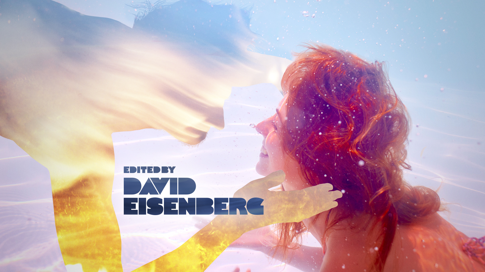
In the main titles, we see snapshots of ordinary people doing everyday things, but with a twist; somebody's missing from each picture. The piece features my first custom font which I'm calling Mara Sans. This project had one week from award to delivery.
Creative Development
Silhouette Treatment:
Getting the silhouette treatment right was vital to the design of the titles. I found the most successful silhouettes were those that felt atmospheric, almost ethereal, but also dimensional. The silhouettes visually bridge two worlds while also amplifying the profound sense of loss created by the missing person from each vignette.
Photography:
Although we were limited to stock photography, we aimed for images that didn’t feel like stock. I tried to capture intimate, candid moments between loved ones. I also didn’t shy away from images that felt just a tad awkward and creepy, because they fit tonally with the show.
Typography:
The custom font I designed juxtaposes the silhouette treatment shown above. Instead of light and ethereal, the type is meant to feel solid, grounded and a bit surprising.
Pre-Production
Final Design Frames
Full Credits
Director: Angus Wall
Design & Art Direction: Mara Smalley
Animation: Sam Cividanis & Tony Kandalaft
Font Design: Mara Smalley
Produced by: Jamie McBriety


